The New York Times has developed an app that lets us see air pollution. The comparison of one's own place of residence with other large cities is particularly interesting.
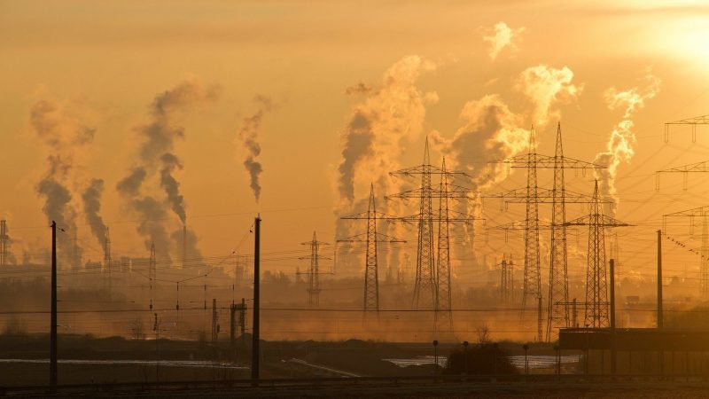
We like to ignore problems we can't see. For this reason, the New York Times has developed an AR app that visualises actually invisible dirt particles in the air. The worst possible pollution is shown, i.e. the worst day of the year. An animation that can be viewed e.g. found here on Twittershows New Delhi. Really impressive, in a negative sense.
The AR visualisation can be found directly in the NYT app for iOS and Android in the "Immersive" section or you can open the the article "See How the Worlds Most Polluted Air Compares With Your City's". with the smartphone in the Chrome browser. Under the second paragraph is a button that activates the AR effect. It automatically finds the user's location - but only larger cities are supported. On the computer in the browser, you can also select different cities and view the values that way.
City comparison through AR visualisation
In the article and the app, the level of pollution is displayed in micrograms per cubic metre. The value is then assessed on the basis of a scale.
The worst pollution is in New Delhi, with 900 micrograms per cubic metre. This value exceeds the scale of the U.S. Environmental Protection Agency, which only goes up to 500. However, these are not average values, but the worst day. The article mentions that developing countries in particular have high values; however, better developed countries with high incomes still struggle with poor air quality. Zurich or Winterthur are in a range of 42 micrograms per cubic metre.
The developer of the application is of the opinion that augmented reality can play an important role in the future in bringing people closer to the problems in their environment by overlaying them with data displays. Exciting are questions like: Why is there more pollution in certain places?
Greta will certainly enjoy it.
Source: Mixed / NY Times


